Design Process: Monica BeJu
- X —iO
- Jul 18, 2023
- 1 min read
Mónica BeJu | Personal Trainer | Portfolio featuring logo, business card, custom icons, low-code website, photography, and social media layout crafted for visual impact.
MONICA'S INSPIRATION
Aside being these her favorite photos, she wants to focus on Women Fitness only accentuating their femininity, as well as their strength and health.

TYPOGRAPHY
fresh | stylish | approachable
Spinnaker, with its nautical-inspired, clean lines, brings a casual yet sophisticated vibe. Montserrat, on the other hand, offers a modern, geometric sans-serif look. Together, they create a harmonious blend of elegance and contemporary style. Spinnaker works well for headings or accents, while Montserrat is perfect for body text due to its readability. This combo is ideal for projects needing a fresh, stylish, and approachable feel.

COLOR
feminine | strong | determined
Extracted from the image above, the vivid red not only represents femininity strongly, but it is also the color she identify herself with.


CUSTOMIZED ICONS
fresh | stylish | approachable
Spinnaker, with its nautical-inspired, clean lines, brings a casual yet sophisticated vibe. Montserrat, on the other hand, offers a modern, geometric sans-serif look. Together, they create a harmonious blend of elegance and contemporary style. Spinnaker works well for headings or accents, while Montserrat is perfect for body text due to its readability. This combo is ideal for projects needing a fresh, stylish, and approachable feel.

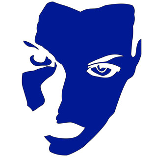
LOGO PROCESS & DESIGN
curvy | feminine | friendly
Inspired by her picture at the beach, turning into the "b", combining text and label for personal branding.

BUSINESS CARD/STICKER

PHOTOGRAPHY

WEBSITE


Comments